
Kusumi Colors: The Trend Transforming Gardening Aesthetics
In gardening, color has always been a focal point. The Kusumi trend introduces softer, dustier hues that promote tranquility and elegance, transforming how we design our green spaces.
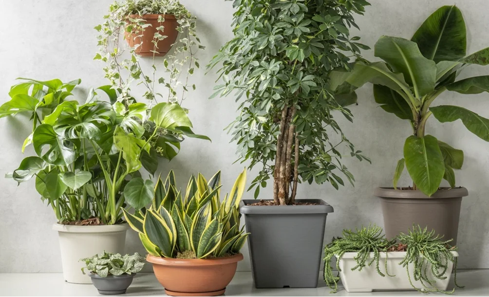
In the realm of gardening, color has always played a pivotal role. Bright flowers, bold contrasts, and vibrant shades designed to catch the eye have long dominated the landscape.
However, a new trend known as Kusumi is emerging, shifting the focus towards softer, dustier, and more delicate hues. Inspired by Japanese aesthetics, Kusumi evokes shades that appear to be gently touched by time, reminiscent of sun-dried petals or slightly faded fabrics. The outcome is a garden that radiates tranquility, elegance, and positive vibes.
As individuals increasingly seek wellness in their home environments, this approach is gaining traction in interiors, balconies, terraces, and gardens worldwide.
Understanding Kusumi in Gardening
The term Kusumi refers to muted colors with subtle gray undertones, lending a sophisticated quality to plant selections. In practice, this means choosing plants and blooms that harmonize with one another, steering clear of overly stark contrasts. Light lavenders, blush pink hydrangeas, antique-toned roses, silver grasses, ornamental sage, and clusters of small white flowers become the focal points of compositions that convey a sense of balance.
Color as a Spatial Experience
One of the most intriguing aspects of Kusumi is its influence on garden design. Instead of starting with individual plants, the focus shifts to the atmosphere one wishes to create. A balcony can transform into a serene, almost therapeutic space by carefully selecting the right shades. Dusty and delicate tones blend seamlessly with natural materials such as light wood, stone, terracotta, and neutral surfaces, fostering a visually harmonious continuity.
The choice of containers also plays a significant role in this experience. Selecting pots that complement the colors of the plants enhances the identity of the arrangement, contributing to a more balanced overall effect.
The Role of Pots in Kusumi Compositions
When working with such delicate palettes, every detail matters. Pots become more than mere supports; they are essential design elements.
The Plastecnic collections allow for the creation of modular arrangements where forms, colors, and textures combine naturally. This is particularly crucial in the Kusumi trend, where the goal is to avoid visual chaos and instead promote continuity.
For instance, the Mood Line collection from Plastecnic provides various interesting options: with a wide range of colors available, one can choose the most suitable shade for their style and desired atmosphere. Those who prefer softer tones can opt for refined and delicate hues such as Rose Quartz, Pastel Green, Peach, Dark Beige, or Smoke Gray, all of which align beautifully with the Kusumi visual language. Conversely, those seeking a more pronounced contrast can use a pot as a statement piece while maintaining overall elegance. Notable vibrant options include Ochre, Red, and Bamboo Green.
Additionally, the warm and natural palettes of the Terrae line integrate seamlessly into these compositions. Colors like Terracotta, Stone White, Smoke Gray, and Dark Beige are adaptable to any space.
By grouping pots of varying heights with coordinated surfaces and colors, one can create small, coherent, and refined landscapes.
Gardening as an Experience to Enjoy and Admire
Perhaps this is the true appeal of Kusumi. It transcends mere color selection; it embodies a holistic approach to gardening. Opting for softer shades encourages a slower pace, inviting individuals to observe and engage with greenery on a more intimate level. This style of gardening does not seek immediate impact but instead cultivates beauty over time.
This philosophy aligns perfectly with contemporary living, where balconies and terraces are often small, well-tended, and personal spaces. Each plant and pot contributes to a sense of equilibrium.
With Plastecnic’s diverse color collections catering to various tastes, interpreting this trend in a personal way becomes easier. Each green space tells a story about its caretaker, and the right color can truly make a difference.